In December I had a real stroke of luck: I was at a joint masterclass by Simon Wardley and Dave Snowden.
Dave Snowden has been known for some time about his contributions to complexity theory, his Cynefin framework.
Simon Wardley, on the other hand, didn’t show up on my radar until about six months ago. Some of his works are ten or more years old, just not as well known. However, Simon’s work is also a fundamentally new contribution.
The seminar – “master class” – was a treasure trove of ideas on how to use the two concepts together, in addition to a brief overview of the theories.
The stroke of luck was approaching Simon about giving a keynote at Agile World. To my surprise, he has time and desire to do so.
To mark the occasion, I am writing a series of blogs to share his key concepts.
At the core are maps, “maps”. Maps are a concept that, used correctly, can make visualization much more effective.
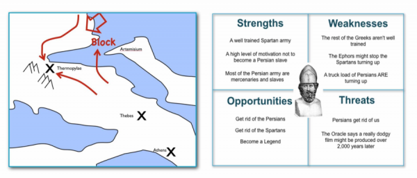
Simon’s first example: how to visualize the classic Battle of Thermopylae – and shows, somewhat polemically, a SWOT graphic as a contrast.

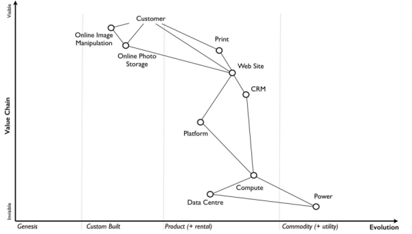
His own maps, the Wardley maps, are constructed quite specifically for strategic analysis.

The X axis, is the direction of movement of products. They start as a genesis, i.e. new invention, next they are handcrafted as needed, then they become a product and finally a commodity. The Y-axis shows the visibility from the customer’s point of view.
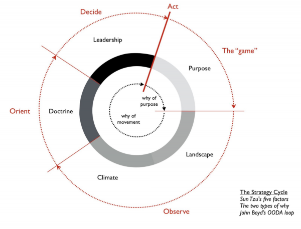
Above this is a strategic circle that begins with situation analysis, then explores options for action, and finally ends with decision and execution. Simon has also collected a large catalog of patterns and heuristics for the various stations of the circle.

Each of these steps is worth looking at in more detail, and I will be doing so in the near future. Wardley Mapping is a great tool, it has already helped us improuvies get smart out of some tough situations and make better decisions. So: more later.


